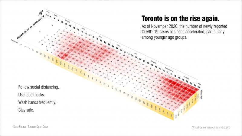
Colors are usually used to convey a message; whether to represent gain and loss, to stop or to go, even to determine a button’s function. But how can we ensure that our users are able to distinguish between the colors in our design?
It is estimated that about 300 million people in the world are color blinded, 1 in 12 men (8%) and 1 in 200 women (0.5%).
Three main types of color vision deficiency are:
- Deuteranopia/Deuteranomaly (green-blind/-weak) (most common)
- Protanopia/Protanomaly (red-blind/-weak)
- Tritanopia/Tritanomaly (blue-blind/-weak) (less common)
As a designer or data visualizer, it is necessary to make sure a color blinded user is able to distinguish between the colors used in graphics.
A common mistake is to use red and green together where each element may represent a different message. I witness it frequently in financial reports where red is used for loss and green for gain. Below charts show how visuals may look like to a person with color vision deficiency.
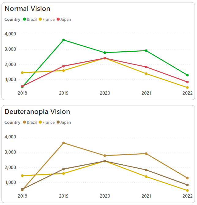
The best way to avoid such mistakes is to try to see the colors from a color blinded person perspective. There are plenty of resources available to help with choosing the right color palettes. I also found a great tool which let’s you simulate colors for either types, and compare against normal vision. You can access it in below link:
https://davidmathlogic.com/colorblind
Interested to learn more? Check these sources:
https://www.colourblindawareness.org/
https://www.allaboutvision.com/conditions/color-blindness/types-of-color-blindness/