This is a great example of seeing the “big picture”.
I fast forwarded the movements of flying aircrafts and then, was able to elicit some insights from it.
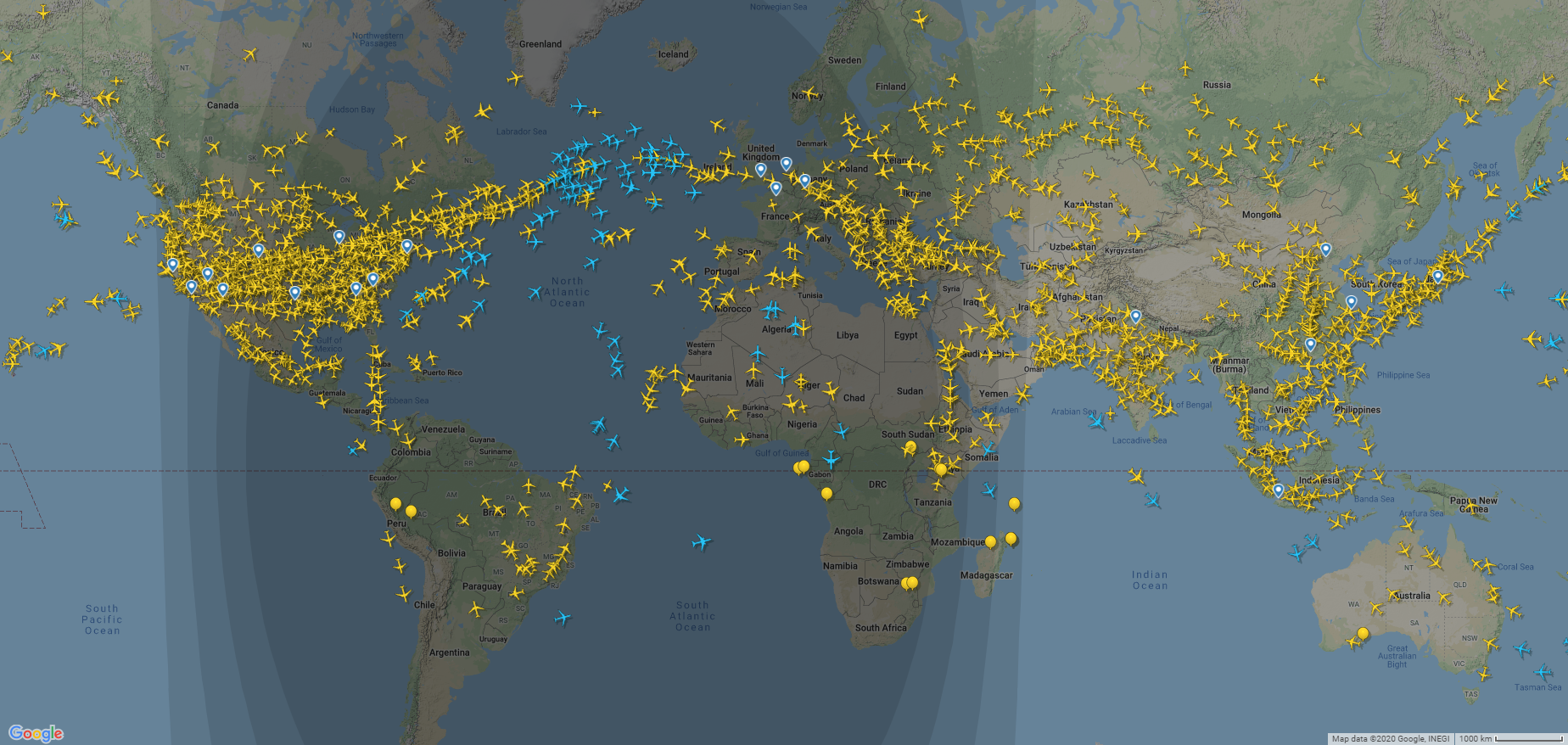
First, I found out European international airports are busy from the early morning with the rush of inbound flights. We can see how flights from North America set to fly in the evening so they will reach Europe in the morning. Those flights are generally return back to their origins as we can see a flock of aircrafts heading back to North American airports.
China has become the largest aviation market in 2020, in terms of number of seats, taking over the US. The visualization shows a congestion in aviation routes between Chinese hubs, as well as other countries in Far East such as Japan, South Korea, Singapore, etc. As the night comes, we can see a huge decline in number of domestic flights in Far East.
In Middle East, you can easily notice the highest congested hubs in the region. Since these hubs are usually act as a connection between east and west, there are always a large number of flights going in and out throughout the day. But you will notice a surge of outbound flights in the morning local time, shows how Middle Eastern airlines manage the connections in a way to fly in the morning, perhaps when they are fully operational in the mornings.
All in all, sometimes we need to change our point of view, or see things in higher speed to get the “big picture”. Watching the aircrafts with normal speed on the map would barely provide any of above mentioned insights compared to high speed viewing. This was an example of how sometimes we can make discoveries by playing!
Now you tell me what do you find in these visualizations? I would be more than happy to have your thoughts.
Data by flightradar24
Sources: