Skip to the content
Mash Nejati
Works
Tutorials
Blog
Contact
Menu
Close
Search
Works
Tutorials
Blog
Contact
Search for:
Search
Search for:
Search
Power Query Optimization: Essential Tips for Better Performance
How to make data visualizations (or any design) more accessible?
How I keep my dataset updated using Azure Data Factory and Blob Storage
Reporting dashboard: Toronto’s COVID-19 data visualization using Power BI
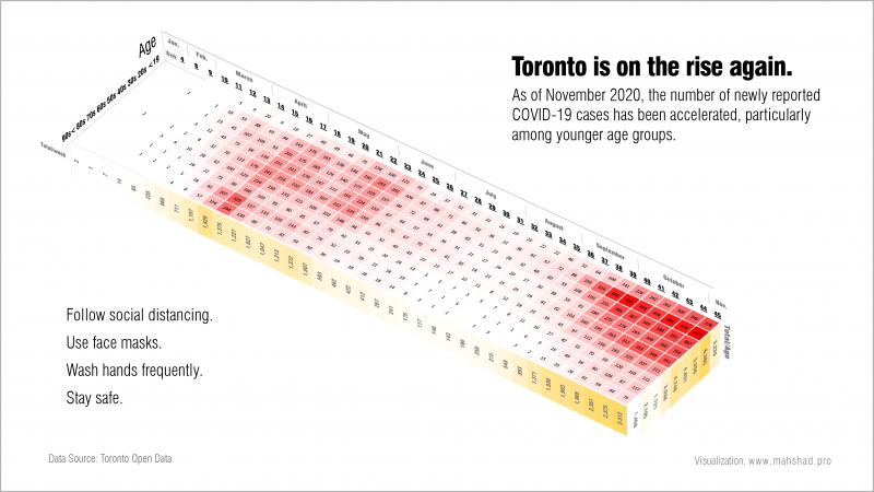
COVID-19 reported cases in the City of Toronto
Formula 1 Comprehensive dashboard — Part I: Creating a SQL database
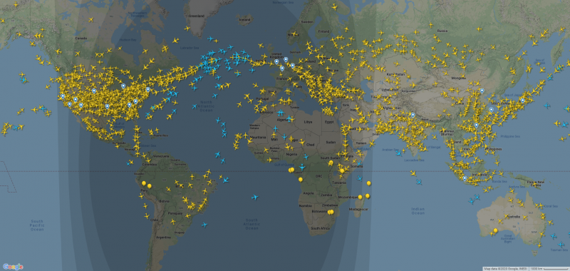
Storytelling: Aircrafts around the world
Creating a business intelligence dashboard with Microsoft Power BI
How to make animated choropleth maps with discrete colors using Python and Plotly